The problem and task
The Moscow Metro is one of the largest transport systems in the world with more than 10 million passengers a day. The infrastructure includes thousands of objects: all of them were built at different times, but require centralized monitoring.
The main problem is the enormous heterogeneity of the data. Many of the objects are tracked on equipment that was created decades ago.
My tasks
- Analyze and structure the inflow data
- Find the optimal solution for visual
- Create UI design for the dashboard measuring 13 x 4 meters
The Process and solution
I studied all the incoming data streams and, in the format of an interview, did a UX research of the needs of future users of the system.
It was very important to sketch out the widgets for the optimal UX solution. In the sketch testing and interviewing together with Metro team we found optimal layouts and made widgets prioritisation.
The results of the study became the basis of the screen grid with priority widgets.
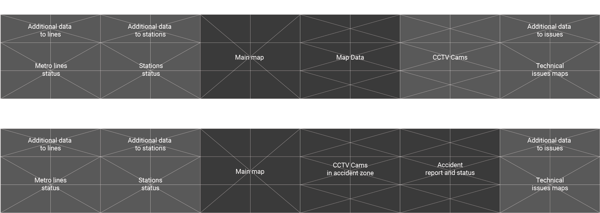
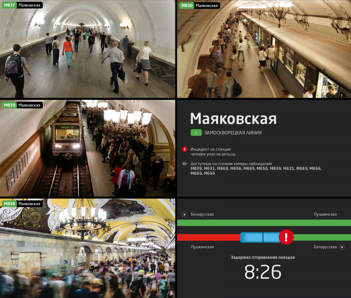
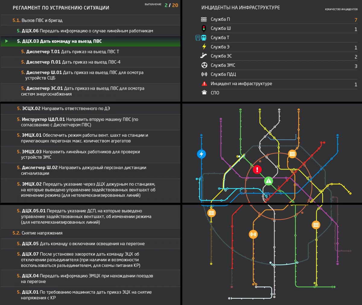
Based on user research I decided to make 2 main modes of the grid: basic monitoring mode and accident monitoring mode.
Every cell of the grid – 65 inch LCD display.
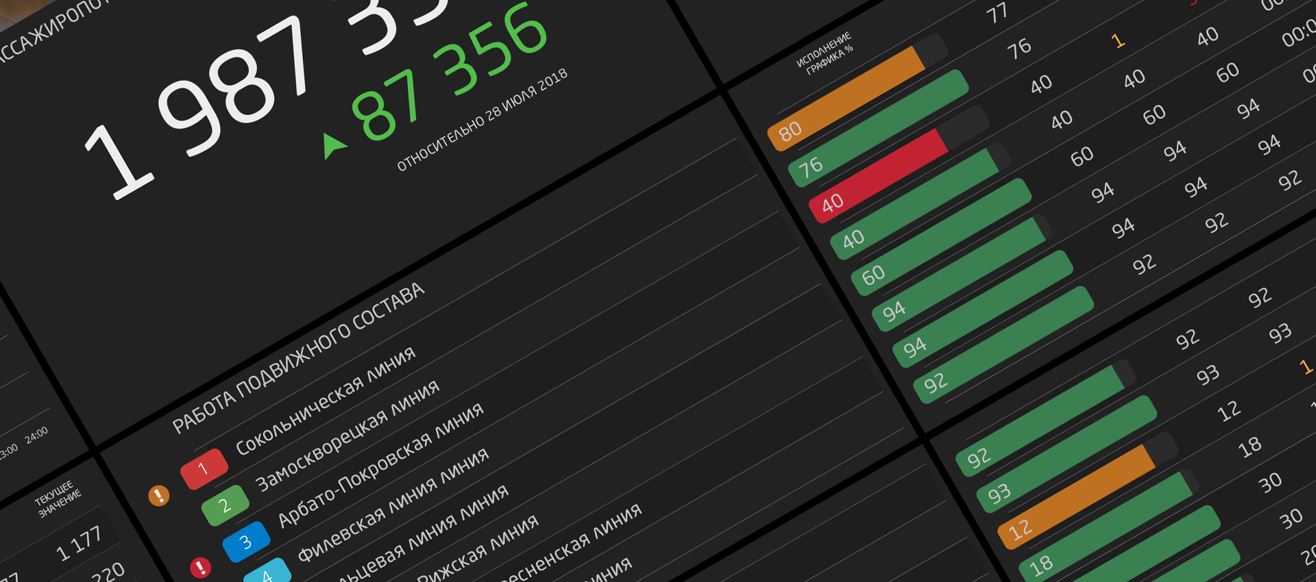
In the process of user testing, the font, color scheme and optimal content density for different groups of widgets were chosen.
Final visual solution
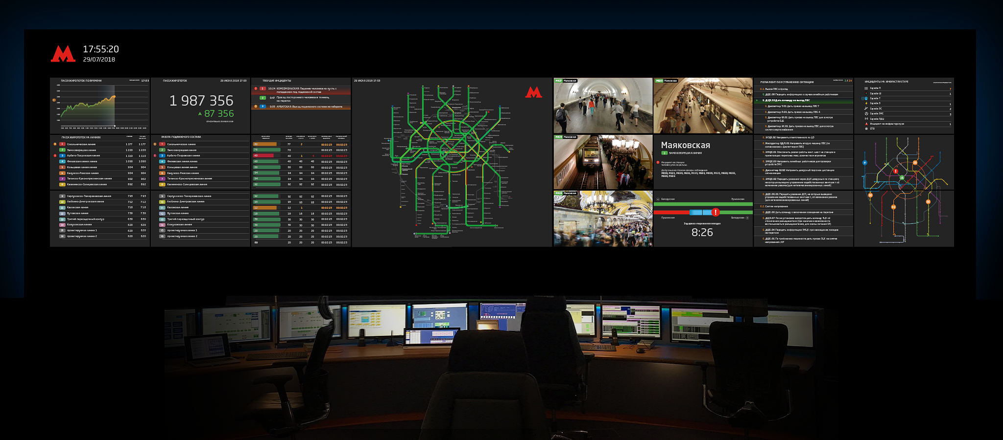
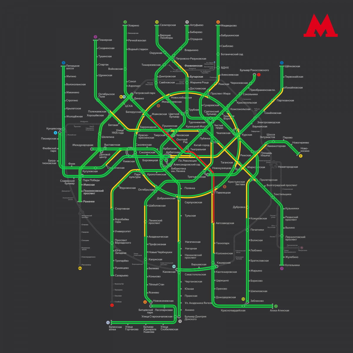
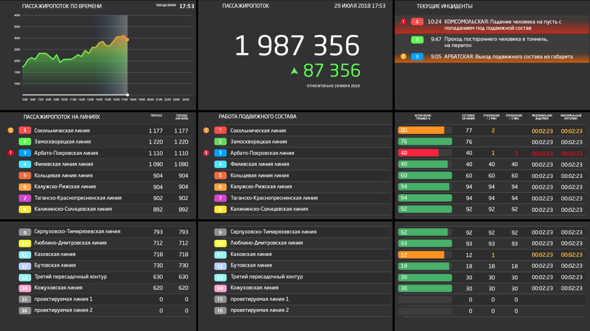
The Problem solving and the result
I structured and made a modern visualization of all heterogeneous data, taking into account the needs of various stakeholders.
The Moscow metro received a new modern management tool for one of the largest transport hubs in the world.
Flexible interface structure allows to connect new data types and widgets without significant costs.